Brief

Comparing LGBT Rankings by Metro Area

1990 to 2014
March 2015

Using data from the Gallup Daily Tracking survey and the U.S. Census, this study ranks the 50 most populous U.S. metro areas based on the percentage of residents who identify as LGBT and the number of same-sex couples per capita.

AUTHORS
  • Gary J. Gates
    Research Director, Former
Highlights
The top five metro areas with the highest percentage of LGBT residents are San Francisco, Portland (Oregon), Austin, New Orleans, and Seattle.
The five metro areas with the lowest percentage of LGBT residents are Birmingham, Pittsburgh, Memphis, San Jose, and Raleigh.
The five metro areas with largest number of same-sex couples per 1,000 households are San Francisco, Austin, Seattle, Sacramento, and San Diego.
Data Points
6%
of San Francisco residents identify as LGBT
3%
of Birmingham residents identify as LGBT
6.5
same-sex couples per 1,000 households in San Francisco
0.64
same-sex couples per 1,000 households in Buffalo, New York
Brief

Introduction

Data that allow for analyses of the geographic distribution of the lesbian, gay, bisexual, and transgender (LGBT) population across geographic areas in the United States have only very recently become available. In 2012, Gallup added a question to its Daily Tracking survey, which interviews approximately 1,000 adults in the US every night and asks respondents, “Do you, personally, identify as lesbian, gay, bisexual, or transgender?” Since then, more than 374,000 adults have been interviewed. These data now provide sufficient sample sizes to estimate the proportion of adults who identify as LGBT by state and, most recently, by large metropolitan areas.

The lack of historical data that identify LGBT individuals makes assessments of how the geographic patterns of the LGBT population in the US have changed over time difficult. However, data from the US Census that identifies same-sex couples have been available since 1990. The 1990 Census data represent the earliest historical data with sufficient sample sizes to consider geographic patterns of at least a subset of the LGBT population, same-sex couples who are residing together in the same household.

These analyses compare rankings of the most populous metropolitan areas derived from the 2012-2014 Gallup Daily tracking data with rankings derived more than twenty years ago from 1990 US Census data. The Census data are used to rank metro areas by the number of same-sex couples per 1,000 households and the Gallup data rank them by the proportion of adults who identify as LGBT.

Results

The rankings compare two different measures: the proportions of cohabiting same-sex couples and the proportions of adults who identify as LGBT. While measures of same-sex couples and LGBT identity are not strictly comparable, studies do show that geographic patterns of same-sex couples are similar to those of the LGBT population. For example, comparing rankings of states by the proportion of same-sex couples using Census 2010 data to rankings of states by the percent of adults who identify as LGBT using Gallup data, the top ten states in both rankings have seven states in common while the ten lowest-ranked states have six states in common.

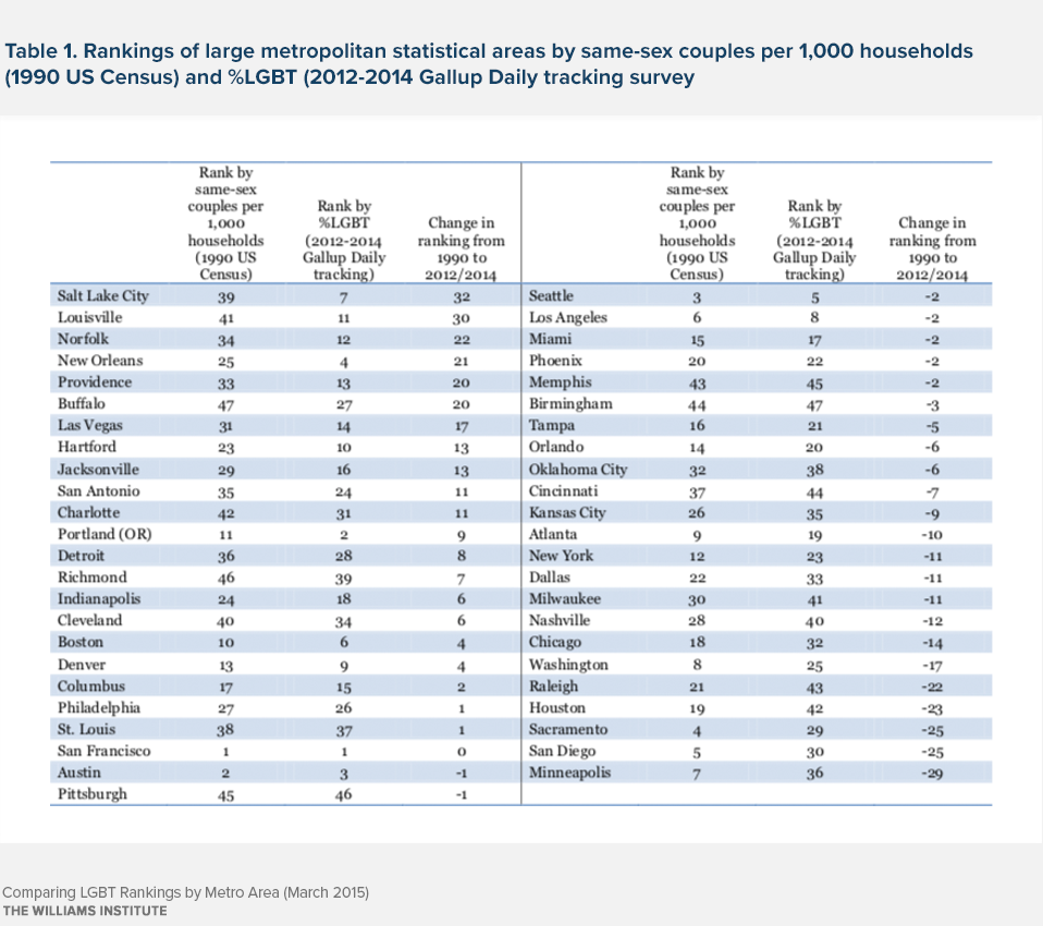
These analyses rank 47 large Metropolitan Statistical Areas (MSAs) that can be matched in the two data sources. MSA definitions are not completely consistent between 1990 and 2012/2014. In the 1990 data, San Jose is included in the San Francisco MSA, Riverside is included in the Los Angeles MSA, and Baltimore is part of the Washington, DC MSA. The Gallup analyses reported rankings of the fifty largest MSAs that included San Jose, Riverside, and Baltimore. Because comparisons are not available for 1990, these three MSAs are excluded in the findings presented here.

Three metro areas are in the top five of the 1990 Census same-sex couple rankings and the 2012-2014 Gallup LGBT rankings: San Francisco, Austin, and Seattle. The Gallup top five MSAs are San Francisco, Portland (OR), Austin, New Orleans, and Seattle. In the 1990 Census rankings, the top five MSAs are San Francisco, Austin, Seattle, Sacramento, and San Diego.
The five lowest-ranked metro areas also have three MSAs common to both lists: Memphis, Pittsburgh, and Birmingham. Raleigh and Cincinnati round out the bottom five in the Gallup rankings while Richmond and Buffalo are in the bottom five in the 1990 Census rankings.

While there are clear similarities between the 1990 and 2012-2014 rankings, several MSAs are notable for ranking quite differently in the two lists (see Table 1). Salt Lake City ranked 39th in the 1990 rankings and 7th in the 2012-2014 data. Other MSAs with substantially higher rankings in the 2012-2014 data compared to the 1990 data were Louisville, Norfolk, New Orleans, and Providence. Minneapolis had the largest change in rankings in the other direction, from 7th in 1990 to 36th in the 2012-2014 data. Other MSAs with substantially lower rankings in 2012-2014 compared to 1990 were San Diego, Sacramento, Houston, and Raleigh.

Implications

It can be tempting to interpret differences in the 1990 and 2012-2014 rankings as evidence that the location preferences of LGBT adults (with same-sex couples serving as a proxy for LGBT location patterns in 1990) have changed somewhat over time. But a 2013 Pew Research Center survey showed that just 12% of LGBT adults considered the levels of LGBT social acceptance in a city as a major factor in relocation decisions. While differences in the location preferences of LGBT people compared to their non-LGBT counterparts may explain some of the geographic variation of same-sex couple or LGBT location patterns across metro areas, differences across metro areas in the willingness of residents to identify as LGBT or as part of a same-sex couple are also likely an important explanatory factor.

Evidence from the data that underlie the metro area rankings reported in these analyses (see Appendix) suggests that the differences across MSAs in the proportion of adults who identify as LGBT or who report being part of a same-sex couple have decreased in the last decade. In 1990, the proportion of households that included a same-sex couple was nearly eight times higher in the San Francisco metro area than in the Birmingham MSA. The Gallup data show that today, adult residents of the San Francisco Bay Area are only about 2.4 times as likely as their counterparts in Birmingham to identify as LGBT. These relative differences between the two metro areas are not necessarily indicative of particular declines or increases in populations of same-sex couples or LGBT individuals. Rather, they likely reflect changes in the degree to which residents in the two areas are willing to identify as such. The visibility of LGBT residents is more similar in San Francisco and Birmingham today than it was twenty years ago.

In the more than twenty years between these two data collection efforts, social acceptance of LGBT people, and the legal rights that accompany that acceptance have changed substantially. In 1990, findings from the General Social Survey (based on author analyses), a biennial survey of adults in the US conducted by NORC at the University of Chicago, show that 76% of adults in the US thought that same-sex sexual relationships were always wrong. By 2014, that figure had dropped to 40%. In 1988, that same survey found that just 12% of Americans agreed that same-sex couples should have the right to marry. In the 2014 survey, 57% of respondents agreed. Marriage for same-sex couples was not legal anywhere in the US in 1990. Today, the vast majority of Americans live in a state where same-sex couples can marry.

As social acceptance has increased, more adults are willing to identify themselves as LGBT. In a 1992 survey also conducted by NORC, The National Health and Social Life Survey, just 1.8% of adults identified as lesbian, gay, or bisexual. The latest Gallup data suggest that this proportion (with the transgender population added) has doubled to 3.6%.

The substantial change in the position of Salt Lake City in the 1990 same-sex couple rankings compared to its position in the recent rankings based on LGBT identity offers evidence of increased LGBT visibility even in conservative states like Utah. This may be a factor in why, in 2015, Utah became the first state in the last seven years to pass a law that prohibits discrimination in the workplace and in public accommodation based on sexual orientation and gender identity. The majority of states still do not have such laws on their books. Substantial increases in LGBT visibility in more socially conservative places like Salt Lake City, Louisville, and Norfolk likely mean that these areas are not as different from cities like San Francisco, Austin, and Seattle (all with long histories of fostering social climates where LGBT people felt more comfortable) in their acceptance of the LGBT community today than they were twenty years ago.

The proportions of LGBT adults in Metro areas can be found here.

Comparing LGBT Rankings by Metro Area